Showing posts with label labels. Show all posts

Sunday, July 30, 2017

No Bells, No Whistles: When Design and Content Marry Perfectly


Perhaps it's it's not surprising that a design museum would have good design.  It was lovely to visit the Cooper-Hewitt Museum a few weeks ago and discover an interactive exhibit that relied only on great design along with pencils and paper (plus stickers) to create a compelling visitor experience.  Yes, I got to try out their pen--but honestly, I enjoyed this more.

The goal of the exhibit was to engage visitors in thinking about how our creative efforts in design can help solve problems.  Incredibly clear, the exhibit began with a start here and then an overview of the process of visiting the exhibit.


Then it led you step-by-step through the design process, beginning with finding a value (interesting, right?  museums don't often talk about values as drivers of behavior).


Then you moved to a question. They were broad enough to encourage creative thinking, yet I began to see the constraints that encourage creativity being put into place.


You're asked to reflect on both question and value.


So far, it's been the incubation step in the creative process. We learn what the process  is, and we begin to gather information.  But the process still needs more information.  Because visitors might not be designers, we're given a hand, with a group of design tactics.  Will you use a stage, social media, a public bath or a police station to, say, increase access to healthy food?

 We're reminded that creative combining is a great way to find solutions.  That's why we're asked to pick two cards.  We've designed our solutions--but that's not the end.  We see real-live designers sharing their projects and we see other visitors sharing their solutions. A physician reminds us that "less is more" is often true in medicine as it is in architecture.


Finally, you get to place your project where you think, physically, where it belongs.  Does it work in a parking lot?  on a roof?  in a warehouse?  Helping to remind us that the city itself is a living laboratory for all kinds of creative experiments (as a rural dweller myself, it's the same thing with different vocabulary).

And although it seemed a bit of an afterthought, I loved this cartoon about successful and unsuccessful community design processes, a reminder that community engagement makes all things better.


Thanks Cooper Hewitt for providing us all with the reminder that pens and pencils combined with ideas are a place where creativity lives.  When it comes time to develop your next exhibit, consider all the alternatives.

PS  I did use the pen, but did not look up my saved works when I arrived home.

Monday, January 9, 2017

10 x 10: My Favorite Posts from the Last 10 Years


This week is the tenth anniversary of this blog. I couldn't have guessed ten years ago, that I would still be writing on a pretty consistent basis, nor could I have imagined all the places I would go, the experiences I would have, or the lessons I would learn (some easily, some definitely the hard way). To celebrate, I've gone back and chosen a favorite post from each year. These posts weren't necessarily the most-read, but the ones that speak to me still.

2007
My own lifelong learning and the chance to support learning through Donors Choose. On re-reading, an appreciation of my parents and of the chance to pay it forward.
Learning for a Lifetime

2008
This post, about a project for the Montgomery County Historical Society, is really about the power of listening to visitors and communities.  I still share this experience on a regular basis as it continues to resonate, particularly in these times.
The Story of La Guerra Civil or Why I Work in Museums

2009
I went to Ukraine for the first time this year, initially for four months as a Fulbright Scholar.  I blogged a lot this year--124 total posts.  Most posts were me trying to make sense of my time in Ukraine. In retrospect, I can see myself learning on the fly, even in some ways I didn't quite imagine. This year is also when my readership began to rise, as I was the museum person writing in English about museums in Ukraine and the post-Soviet world. This post, about a visit to Chernobyl, another experience that remains deeply with me.

2010
Upon re-reading this post, I was struck by the continuing importance of deep personal connections. One of the stories is about Crimea, more meaningful and poignant now.

2011
Not much extra comment needed.  Not much has changed since this post except more sustained attention to the issue of gender in museums.
Want to Be a Museum Director? Evidently, Be a Man

2012
I'm lucky enough that my work takes me to all kinds of museums and I enjoy reporting back on work that surprises, intrigues and stimulates me.  Here, a Parisian museum totally took me by surprise, in the best way.
When Was the Last Time You Were Surprised at a Museum?

2013
An interview, as history was being made, with my dear friend and colleague, Ihor Poshyvailo, about museums and Maidan. It's fitting that he's now director of the new Revolution of Dignity Museum in Ukraine.
"Our History Museums will Include the Events of These Days"

2014
Over the last several years I've written often about the process of re-interpretation at the Harriet Beecher Stowe Center. In this one, we're encouraged to give up chronology in the service of more interesting interpretation.
Surrender the Chronology!

2015
Connected to #museumsrespondtoFerguson, this post reflects on the ways I view my own responsibility to work for change after attending an AAM meeting.
We Are Not Separate from Politics: AAM and Beyond

2016
Back to reporting on surprising museums--and tremendous labels.
Brilliant Labels in Dublin: Sweets, Nudes and U2

Here's hoping for another ten years of museum visiting, drinking coffee, meeting all of you, traveling, blogging and learning.


Friday, October 28, 2016

Whodunnit? The Tale of the Missing Credit Panel


Recently I found myself in a conversation about credit panels for exhibitions: who's on, who's not, and why.  I posted a request for samples on Twitter and Facebook and thought I'd share a bit of what I learned from all of you (thank you everyone!)

Basically I found that credit panels fall into two groups.  First, there's the more the merrier:  the museums that take the opportunity to acknowledge as many people as possible. For instance here, from the Museum Centre Vapriikki in Tampere, Finland, via Katrin Hieke in Germany:


And from the Oakland Museum, via Suzanne Fischer, egalitarianly without job titles.


From Dean Krimmel and the Jewish Museum of Maryland:  Funders, administrators, staff and even students.

And from the Peabody Essex Museum in Massachusetts, a high expression of the form, letting the public know that exhibition development is a team effort in every way.  As the label says, "it's a complicated creative process" and that that process is made of real live people, working together.  So much more compelling than just names. I also enjoy the fact that the sponsors are credited in the informal "Hi!" from the director.


Annemarie de Wildt of the Amsterdam Museum in the Netherlands shared on Facebook that:
"We discussed this issue recently in a discussion about the future of the museum with a theatre director. In the theatre/film it's of course very different: naming everyone although the difference in importance shows in the size of the letters."   
But there were those of you whose organizations shared credit for sponsors only.  Colleagues responded to my Facebook query saying:
"We don't include staff but we do include our Advisory Panels that are made up of community members and scholars."
"I don't think we have a real pattern or logic to it. I think the consultants is because it's assumed that otherwise no one would know they helped. Internal, it's just part of our day job. But [at our museum] there's been no deliberate conversation about it. We had some fairly long conversations about who should go on the newest one (it was a community-sourced project with a TON of donors & participants) but the question of internal staff never came up."
"It has been discussed. The question comes up periodically and I am certain it will come up again. We seem to fall on the "no need to print a thank you for doing your job. I don't see how you can thank exhibit staff without acknowledging development staff who raised the funds, education staff who carry out programming for the duration of the exhibit, marketing staff who make sure we're covered in the press, etc. We publicly acknowledge exhibit staff at opening event where donors and sponsors are present. We reserve panels for sponsors and donors."
Where do I fall?  I'm all for credit for everyone.  Exhibits, even small ones, are complicated animals, requiring the skills and talents of so many people, from wall-painters to label-writers to the person who saves you by working late one night to reprint something.  Public credit is cheap.  Why should we be stingy about it?  Couldn't we take our inspiration from the Car Talk guys and their credits?  A sense of humor never hurt anyone.

Tuesday, July 26, 2016

Fabulous Italian Labels


I saw some amazing labels in Milan, Italy.  No, not the ones you expect, like Prada or Gucci, but real, live terrific museum texts.  In general, I've found that Italian museum labels are pretty bad--either containing the barest amount of text or deep into theoretical knowledge that the average museum-goer can't penetrate.  But evidently Milan is a place where engaging labels have taken hold--and even more of a feat, engaging labels in English.  I have a huge appreciation for museum label writers who engage all of us in a language not their own, making the labels sing with a kind of poetry.  I'll be writing another post with some further reflections on the ICOM conference, but before it's too far away in my mind, enjoy the labels!

First, at the Museo della Scienza e della Tecnologia.  An ICOM open night was also a public free night, so the museum was mobbed, but amidst the crowds, I found myself intrigued by labels like these.  I found many of the labels I liked more poetic than the usual.  Here's an opening label for the entire museum.  It says,
The museum is alive. It belongs and is open to all.  Today the world spins fast and we are all looking for explanations and opportunities. The museum is alive; it is the museum of the becoming of the world.
And an exhibit on clocks and watches, asked a philosophical question to begin:


I only had time for a few exhibitions, and those I saw quickly, but I found the exhibit Food People, a particular standout.  It looked at the future of food, and was very clear about the ways in which community feedback helped shape the project, as explained in this label.


The introductory labels helped us understand the theme, and why this exhibit was in a science and technology museum.


A hallway exhibit explored how we imagined the future of food, from 1900 to today and evidently there's a Trekkie at work at the museum, because one of the examples was this,  that food would be replicable and multi-cultural, with Star Trek dialogue as the text.


A very different museum is the Pinocoteca di Brera, a classic picture gallery, but with a new director, James Bradbourne, formerly of Palazzo Strozzi in Florence.  I loved that the gallery now explained its purpose with a quote from a former director, Franco Russoli.
"A museum is a place for participation, not for evasion or isolation or separation, that liberates its visitors by engaging them."

Also at the entrance and throughout the museum, new labels explained why museums do what they do and the changes they see in the galleries.   New family labels and labels written by artists and writers, encourage us to think in new ways about what we're seeing.


I love that this label connects St. Peter's expression in the art with the physical properties of the painting, conservation issues, and another way to look at all the other work in the room.


Here's a description devoid of art historical terms, yet getting us to think about the work's composition and thinking about what might have happened outside the frame, before and after the scene depicted in the painting.

At the Milan Triennale, which happens in venus indoors and out all over the city, I found the exhibit, Neo-Prehistory:100 Verbs curated by Andrea Branzi and Kenya Hara. The visitor wound through an exhibit of seemingly unrelated objects, one hundred tools, each identified by a verb that took us from pre-history to the present.  Rely:  an iPhone; Despair:  a bomb; Fascinate:  a bottle of Chanel No. 5. The verbs' definitions are the only label text in addition to the simplest object ID labels.  Yet I found myself puzzling and reading each one.  Sometimes I was drawn by the object to read the label, but sometimes vice versa.  How does the story end?  Regenerate, with a visualization of the human heart.


Is there a takeaway about these labels as a group?  I think it is that there is no one way to write a label and that each exhibit, each institution, must find their own voice, but it must be a voice that speaks to visitors and connects us emotionally, to our whole selves.

Thursday, March 3, 2016

Brilliant Labels in Dublin: Sweets, Nudes and U2

I love to be surprised in museums and it doesn't happen often, so I was thrilled to be genuinely surprised by labels(and more) at the Little Museum of Dublin this week. The Little Museum is the city of museum of Dublin and embraces its status as a museum of the people. It also embraces and embodies the values of generosity, informality and friendliness.

Here are two labels from the beautiful Georgian room where the tour starts.

Sweets and a label explaining why there are few labels, based on what we know--totally unexpected. I was definitely surprised! Plus, a great label explaining Georgian architecture. Good questions, and a big "so what?" for the visitor to contemplate as well.

And next, a label explaining this image the image at below left.


Make sure you read that last line. I was happy to learn about Nell McCafferty, but even happier that the label on this object challenged, in the nicest way (is nice overrated? not here) both museum practice and the visitor's own assumptions.

Lots of museums are complimentary about former politicians, but not many make political statements, even a soft one, about the contemporary need for civic leadership. And it's not only politicians who come in for a bracing critique. The museum's U2 exhibit traces the history of the city's most famous band in an space developed by fans. But did Bono and the rest become sell outs?

Even the gift shop embraces the spirit evidenced in these labels.
I've got another post to write about their exhibits commemorating the centennial of the 1916 uprising, but you may also want to check out their City of a Thousand Welcomes project. For free, you can sign up and meet a local for a cup of tea, coffee or a pint and conversation. Both visitors and residents who want to be Ambassadors can sign up via the website. I didn't have time to do it, but it's definitely on my list for a return visit. More than 2000 visitors last year took advantage of the offer.
And the take-away here? Ideas don't cost money. Most of the labels are simply produced--the effort is in the thinking and writing. The Thousand Welcomes project could be done by museums almost anywhere. No bells, whistles, or holograms here, just a reminder of what we can be as community-based museums.
Thanks, Little Museum for such a surprising, inspiring visit!


Sunday, March 29, 2015

Label? What?


I'm in L'viv, Ukraine, for a month, so many posts to come from here (and if you want to see what this beautiful city looks like, you can follow me on Instagram). but first I'm trying to catch up on some other interesting things I've seen this year.  This post goes way back to January, to visits to the Dennis Severs House and to the Museum of London's Sherlock Holmes exhibit.   Both, in their ways, are works of the imagination--creative museums at work in ways that stimulate and challenge visitors.

If you haven't been to the Dennis Sever's House, it's not like any other historic house. You have to make a reservation, for the evening.  I walked down a cobbled street, knocked on the door, and a museum staffer steps outside with his Ipad in hand, welcomes me, and sends me into the house, asking for quiet.  No guided tour, no labels.  You are free to wander in silence, with just a few other visitors, through the rooms of this 18th century house, set up as if lived in by a family of silk weavers; lit by candles, surrounded by the debris and decay of everyday life.  But it's totally made up.  Dennis Sever was an artist. His goal, says the website,  "what you imagine...is his art."  No photos, not surprisingly, so the below is from their website.  But a picture really doesn't convey the sounds, the smell, the entire experience.  It really encouraged slowing down, taking your time, wondering.


But there are labels.  And that's part of what made it really interesting to me as a museum person. Here's just a few of them I scribbled down.
"Every object in this house should be seen as part of an arrangement.  Each array tells a story..." 
"What?  You're still looking at "things" instead of what things are doing?" 
"Make no mistake...in the house it is not what you see, but what you have only just missed, and are being asked to imagine."
What would happen if we wrote labels like that?  That we trusted our visitors to go for it, in terms of what they're thinking and feeling?  If we allowed their own imaginations rather than filling their heads with facts?  There's no touching in the house (and funny it seems like people don't try to) but it is a full immersion experience.  Severs has given visitors a great gift--his imagination stimulates ours. If you're in London, go!


On that same trip, I visited the Sherlock Holmes exhibit at the Museum of London.  Holmes, of course, is a great imaginative creation, who lives on in books, movies, and television (and yes, they did have Benedict Cumberbatch's coat on exhibit).   This wasn't the work of a single imagination, but rather I suspect a clear team effort--and one where a team somehow felt spurred on by each other.  I imagine a meeting where someone says, "Let's start the exhibit with a bookcase,"  and then someone else says, "Yes, and it can be a secret bookcase,"  and someone else says, "Yes, and visitors have to enter secretly," and some exhibit designer says, "sure!"

I loved the interplay of historical fact--the London of Conan Doyle's day, that he surrounded Holmes with, and the written words from the mysteries.  I loved that certain abstractions and talents of Holmes--observation and deduction, for instance, were explored through very clear installations of objects, some of them very everyday (shoes and eyeglasses, for instance).


And of course, although I didn't take one, I loved the nod to contemporary life at the final stop (and the Sherlock-shaped shortbread in the cafe)


My takeaways?  To remember that great, creative ideas sometimes come from individuals and sometimes from collective work; and to make space for both those in exhibit development; to always remember that many exhibits need a sense of humor; to understand the power of emotions; and to keep looking out for those inspiring exhibits.  What have you seen lately that inspired you?  What has brought you out of the abyss of boring exhibits?


Thursday, February 20, 2014

No Bells and Whistles Needed: The Rijksmuseum


Last week I had the chance to visit the Rijksmuseum in its newly restored  and re-opened, glory.  I’d been aware of their great website,  Rijkstudio,making hi-res images available for free, and encouraging people to make imaginative, creative re-use of images from their collection.  So in my head, perhaps, I assumed that technology would be a key part of the visitor experience at the museum itself.
And to my surprise, I discovered exactly the opposite.   There was an audio tour, which I did not take, but what really shined through was the idea that museums are places of discovery, but many of us need a bit of help in our discovery.  We might not need a fully immersive, high tech experience, just a bit of knowledge to start our journey.


The Rijksmuseum provides a low-tech experience, but it's clear that there was a substantial investment in creating the most thoughtful experience possible.  From a visitor perspective, it seems the investment was in thinking, in people time, rather than hardware.  In conversation with another Dutch colleague,  he thought that the museum considers its website as a way to reach people outside of the museum;  but that the experience at the museum needed to be entirely different--a great lesson as we plan new experiences and exhibits.

I saw this attention to detail--to the visitor experience-- in a number of different ways.  First, the introductory room labels are so well written, in both Dutch and English.  They are clear, in the active voice, brief, and informative, giving a “so what?” clarity to each group of objects.  They provide, in effect, the 101 explanation of the topic at hand.
And then, particularly in the Gallery of Honour,  I was amazed at how many people were using the laminated handouts available.  These kinds of handouts exist in many museums—but I have never seen so many people using them.  What made them work?  They were not just repetition of label text, but they were really about looking at the work of art.  At the top of the post and below, are all kinds of people using the handouts.  I saw one family, Italian speakers, using the handouts so they worked even without understanding the written words.  I really liked that they encouraged you to look closely and even to compare paintings next to each other.   They weren't jargon-filled in any way.
I also trailed around several school groups and I also discovered that they took an approach that really encouraged curiousity, without lots of bells and whistles and with a kind of informality that made students feel at home.  Almost every student in every school group had a phone and was taking pictures, and as a group of students moved to a new location, there was a small bit of time permitted for that picture taking (even selfies in front of The Night Watch) and then, down to conversation.   Rather than forbidding photos, this meant that students created memories, but also found time to listen.  Each school docent had a big shoulder box of objects that they also carried--I didn't come across any of them in use, but as you can tell from the image below, they were simple things.
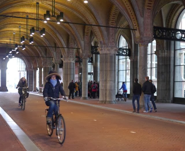
I found the Rijksmuseum a refreshing reminder that I need to bring this same kind of clear-eyed passion and focus on the visitor to all my work with the kind of confidence I saw embodied here. And of course, amidst the 375 million euro renovation, a clear demonstration of, as my colleague Anne Ackerson taught me, "Ideas don't cost money." Plus, as a bonus, what other museum can you ride your bike through!