Last week I had the chance to visit the
Rijksmuseum in its newly restored
and re-opened, glory. I’d
been aware of their great website, Rijkstudio,making hi-res images available for free, and
encouraging people to make imaginative, creative re-use of images from their
collection. So in my head,
perhaps, I assumed that technology would be a key part of the visitor
experience at the museum itself.
And to my surprise, I discovered exactly the
opposite. There was an audio
tour, which I did not take, but what really shined through was the idea that
museums are places of discovery, but many of us need a bit of help in our
discovery. We might not need a
fully immersive, high tech experience, just a bit of knowledge to start our journey.
The Rijksmuseum provides a low-tech experience, but it's clear that there was a substantial investment in creating the most thoughtful experience possible. From a visitor perspective, it seems the investment was in thinking, in people time, rather than hardware. In conversation with another Dutch colleague, he thought that the museum considers its website as a way to reach people outside of the museum; but that the experience at the museum needed to be entirely different--a great lesson as we plan new experiences and exhibits.
The Rijksmuseum provides a low-tech experience, but it's clear that there was a substantial investment in creating the most thoughtful experience possible. From a visitor perspective, it seems the investment was in thinking, in people time, rather than hardware. In conversation with another Dutch colleague, he thought that the museum considers its website as a way to reach people outside of the museum; but that the experience at the museum needed to be entirely different--a great lesson as we plan new experiences and exhibits.
I saw this attention to detail--to the visitor experience-- in a number of
different ways. First, the
introductory room labels are so well written, in both Dutch and English. They are clear, in the active voice,
brief, and informative, giving a “so what?” clarity to each group of
objects. They provide, in effect,
the 101 explanation of the topic at hand.
And then, particularly in the Gallery of
Honour, I was amazed at how many
people were using the laminated handouts available. These kinds of handouts exist in many museums—but I have
never seen so many people using them.
What made them work? They
were not just repetition of label text, but they were really about looking at
the work of art. At the top of the
post and below, are all kinds of people using the handouts. I saw one family, Italian speakers, using the handouts so they worked even without understanding the written words. I really liked that they encouraged you to look closely and even to compare paintings next to each other. They weren't jargon-filled in any way.
I also trailed around several school groups and I also discovered that they took an approach that really encouraged curiousity, without lots of bells and whistles and with a kind of informality that made students feel at home. Almost every student in every school group had a phone and was taking pictures, and as a group of students moved to a new location, there was a small bit of time permitted for that picture taking (even selfies in front of The Night Watch) and then, down to conversation. Rather than forbidding photos, this meant that students created memories, but also found time to listen. Each school docent had a big shoulder box of objects that they also carried--I didn't come across any of them in use, but as you can tell from the image below, they were simple things.
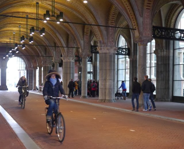
I found the Rijksmuseum a refreshing reminder that I need to bring this same kind of clear-eyed passion and focus on the visitor to all my work with the kind of confidence I saw embodied here. And of course, amidst the 375 million euro renovation, a clear demonstration of, as my colleague Anne Ackerson taught me, "Ideas don't cost money." Plus, as a bonus, what other museum can you ride your bike through!


1 comment:
It seems like a very great visit. I'm particularly interested with the handouts, I'm thinking these handouts would make the visitor inspect what an artist would look at. Wish to visit that museum soon. Thanks for sharing your experience!
Post a Comment