Friday, January 30, 2015

Clarity and Memory in Berlin


January 27 was the 70th anniversary of the liberation of the death camp at Auschwitz. It also happened to be the day that I visited the Memorial to the Murdered Jews of Europe in the heart of Berlin. The memorial itself, with its hundred of grey stelae, stretching over a large space is certainly memorable (and has been controversial) but the exhibition itself in the information center underneath the memorial was a moving demonstration of the ways in which clarity and a conscious hand on what we present and how we present it can make an experience memorable. The exhibit has no objects--and it's not very big--just two of the what I'm sure were many constraints successfully addressed by the exhibit team.

You enter the space and begin by a hallway timeline, just images and text, about the Nazis efforts to exterminate the Jews and others. I didn't linger here, as it was crowded, but was interested in how many people were taking time to read the text. But you turn the corner and you see the image at the top of the post, large, at the end of a room. Just six people, representing the 6 million. You understand immediately that this is not a story just about numbers, but about people. And that focus on individual people is the thread that carries through.


Next, a space with large back-lit panels on the floor. Each one had a reproduction of a fragment of a letter written from a camp; along with English and German transcriptions. I was traveling with college students and one said afterward, "I felt obligated to read every single one." When I asked her to explain, she described it as more a responsibility--that she owed it to each of those people to read the text, honor and acknowledge them.


Those individual people all had families. The next space had six stories, of six families, from all across Europe and what happened to them, told just in photos and text. A different student said he connected more directly with this room; really understanding the idea that whole families, from all across Europe were lost forever. Again, the curatorial skill made concepts real and concrete.

As I entered the next gallery, I found darkness just a single name projected on all four walls, grey benches to sit on, and audio, first in German and then English. Again, it was about individuals. Each name was a person murdered by the Nazis and again made each person real, made you feel you were meeting a person.


A final room talked about the camps themselves. A map located them all over Europe and again, panels provided specific information. The panels created small booths, where individuals could sit down and listen to the voices of survivors about the camps. Throughout the exhibit there always felt a kind of intimacy, in a way an antidote to the bureacracy that carried out the murders.

I spend a great deal of time thinking about interactives or about how to create dialogue in museum settings, or how to make objects compelling. This museum, so clear in its focus and intent, reminded me that although we have an ever-greater number of tools in our interpretive toolboxes, the clear, thoughtful minds and eyes of exhibition developers and designers may be the most important.


As I came up out of the museum on this anniversary, I saw an older couple walk up to one of the stones and gently lay two bouquets of white flowers down and then spend time walking among the dark grey stones, under a dark grey sky and my eyes welled up. Remember.

Tuesday, January 13, 2015

Celebrate Small Success but Aim Big


I had asked one of my 2014 mentees, Megan Wood, Edsel and Eleanor Ford House (above) Associate Vice President of Education & Visitor Experience, to do a wrap-up about success, failure and learning in a new job--as that was the focus of many of our year-long conversations. Here's her thoughts.


2014 was a really big year for me.

We bought a house, we sold a house.
We moved to a new state.
My husband and I left our jobs and took on new jobs.
Every one of our siblings either moved and/or had children in some combination.

In my new job, I decided to tackle a few big projects while hiring new staff, learning my responsibilities, and continuing to staff and program the site. The first project was comprehensive visitor studies that would provide us with data about our visitors’ pre-conceptions, understanding and takeaways. The second was a brand new interpretive plan to serve as a decision making tool for all programming and on site interpretation.

Being new and taking on big projects has its real benefits and drawbacks.

Benefits:
  • Coming in with a fresh set of eyes and not being afraid of the outcome.
  • As the “new person” your ideas can sometimes seem fresher, even if someone else has already being trying to accomplish the same task.
  • There can potentially be more support of the project because there is an expectation that new people will do new things.
Drawbacks:
  • Going down a path that has already been trudged and staff are weary.
  • Accidentally stepping on toes or feelings.
  • It can be hard to navigate project management while also learning the culture of a different institution.
  • Trying to advocate for a project while still building trust can take a lot of time.
  • Learning a new job is hard enough sometimes!
How’d I do?
  • I would say I had 75% success on one project and about 20% success on the other.
  • We’re about to get reporting on a visitor studies project. It is not the full scope of the original project, but rightly so, my boss wanted to see results before agreeing to commit more resources.
  • We are still in the middle of interpretive planning. It has been an evolving process and that has both grown and shrunk over time. Do I wish I was further along? Yes. Do I think it’s actually possible to have this project almost done sitting here almost a year later? No.
What did I learn?
  • I think it is ok to dream big with projects, but I think I can be more realistic in my dreaming in 2015 now that more experienced in managing projects at my new workplace.
  • I will celebrate small success more and not beat myself up for what didn’t get done. Chances are, we’re still doing a lot of good.
  • Continue to be ambitious and excited about the good work I want to do and bring my colleagues along with that enthusiasm. Roadblocks are not the end of the world, just the end of one path. Maybe there’s a better path to follow.
In closing, I want to thank Linda for her year of mentorship. Big years are good years to have an outside, somewhat disinterested, party to listen and give advice. It was a great help and kept things in perspective.

Tuesday, January 6, 2015

Dancing into the New Year: Inspirations


To start 2015 in a culture of appreciation, I want to share two recent New York City museum experiences that reinforced for me the importance of joy and creativity in our work.

First up, the Cooper Hewitt Museum. Much has been written about all the technology in play at the museum--but that's only part of the reason to go.  Not surprisingly for a museum of design, design for humans is at the center of the entire experience. What do I mean?


The technology is easy to access.   The very large touch tables in several locations draw you in; and they're easy to use--you never feel like a failure when something happens you don't expect, you feel like an explorer.  In the immersive wallpaper room, a couple turned to me and said, "how do you do this?"  I admitted I didn't know either, and then watched them easily create their own wallpaper designs that then filled the room.  The museum encourages creators--I would have assumed that more people were interested in seeing historic wallpaper on the walls of the space, but in fact, more people seemed to be interested in creating their own.


But the technology is not the reason but the tool. (If you want to know more about the technology, check out Seb Chan's post about what he's been doing when he hasn't been blogging over the past year.)  To me, the central part of all the exhibitions was an exploration of ways in which design is at the center of so much human activity.   Well-written clear labels encourage you to really consider design,  and in the Process Lab, plain old hands-on tools are combined with touch tables in interesting ways.   I watched a woman in her 20s spending a long time designing a shade for a lamp, encouraged by these simple prompts.


Museums are often sooooo serious.  This museum has a sense of humor.  I liked the categories for rating ideas on this touch table:


And I liked that the sense of humor encouraged others to approach work in the spirit of playfulness. Maira Kalman's exhibit exemplified a sense of humor--and of wonder-- that is throughout the whole museum.  Here's one of her labels:


And here's one visitor's idea for a combination object solving a problem:


Because it's in a historic mansion, the scale also seems very human.  The installations, often very beautiful, encouraged deep, sustained looking from all kinds of people.


But perhaps my favorite view was an unexpected reminder of the importance of design in our everyday lives.  As I came downstairs from the exhibit on tools, I heard a familiar noise in the stairway--the brisk whisking all of us know.  I looked down, and there was a member of the staff, sweeping away, with a straw broom, a tool that has existed, in virtually similar form, for thousands of years.


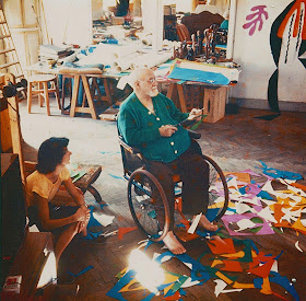
The second exhibit that inspired me?  Henry Matisse:  The Cutouts at the Museum of Modern Art.  The installation was great, giving you places both to look close-up at the work (and learning that he actually used pins because he was always changing them) and spaces to step back and get a big view (of, for instance, the work at the top of this post).  I appreciated that the curatorial voice was focused on the creation of the work--and in some places, by its preservation.  


Matisse's determination, experimentation and joy resounded in every room.  We've got a print of one of the cutouts in our bedroom and I'll never look at it quite the same way again.  The exhibit took something familiar and made it entirely new to me.  And, for those who think that looking at images online will discourage visitation (and there are still some who think that); seeing these works in person was so much more, so different, so much more moving, that looking at my screen.

I haven't made a list of resolutions for the new year, but this post coincides with two activities I've come across that I'm going to try and make a part of my process.  First, keeping a surprise journal  and second, thanks to my colleague and friend Anne Ackerson, keeping an accomplishments jar.  Matisse's surprise journal would have been full every day, I feel; and colleagues at the Cooper Hewitt must have their accomplishments jar overflowing as the new year starts.  May your and my new year be the same.


Matisse images from the very thoughtful and beautiful website for the exhibit at the Museum of Modern Art.